While I’ve enjoyed museums since I was young, it’s only in the past decade or so that I’ve truly begun absorbing all the text and other interpretation they have to offer rather than seeing each cool artifact or exhibit and moving on to the next one. Needless to say, reading the information provided by institutions of public history is the only real way to appreciate their attempts at interpreting the history they contain, and can only enrich your experience. As I perused the collections of the Birmingham Civil Rights Institute this month, however (my second visit, the first being in July of 2022), I couldn’t help but think there was a glaring exception to this rule:
Timelines.
Now don’t get me wrong; I think placing events in order of relative chronology is an absolutely essential foundation of any historical education, and have privately lamented its neglect in many secondary-level classes. Timelines can be a great resource in pursuit of this goal, reminding students of the proper context of the events they’re currently reading about and, especially, providing an excellent studying exercise when students are asked to construct one themselves.
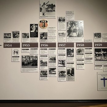
Yet these are not the instances in which I’ve encountered timelines in the arena of public history. These timelines are commonly situated at the beginning, end, or transition point between segments of exhibits, and my personal experience with them leaves much to be desired. While some can incorporate engaging visual aids or pleasing aesthetic design, they are almost always crammed full of as much information as possible as the exhibit designers seemingly attempt to provide all the wider historical and geographic context of their museum in one fell swoop, freeing up individual displays to focus in on what they really wanted to talk about. Timelines situated at the beginning of exhibits suffer the most, as visitors are not yet acquainted with the events included, and those that attempt to include wider events in global or national history are also ironically worse, cluttering the display with events that most of the public (sometimes including myself) do not recognize and are not discussed in any way by the surrounding interpretation. Even I cannot help my eyes from glazing over, and at BCRI weeks ago I found myself simply skipping them in their entirety.
So what’s to be done? Is there any way to make timelines more pleasing and effective, resurrecting their utility for public history? I personally think there is, but only if we take a larger view of what should be considered a timeline. If history itself is one grand, interconnected, contingent timeline, then museum exhibits could be seen the same way. Breaking up relevant context and seeding it throughout the course of an exhibit would allow for more room to make text more accessible and pleasing as well as moving it into closer proximity to the interpretation that it would enhance–not to mention ideally driving its designers to cull events to those more intimately tied to their material. In this way, visitors might be able to feel the flow of history more naturally, understanding more fully how events tie together and influence everything around them.
Now I admit, while I’ve had a bit of experience in the field, I am not a public historian by either training or profession. I cannot speak to how feasible this proposal is. It would certainly take a heavy redesign of existing museums to implement, but I cannot accept that there is no way to provide chronological orientation and context to the public other than through cluttered, dense timelines of the kind I’ve encountered in my travels. One day, maybe, I’ll come across a better one.